Let’s create experiences that matter.
© 2017-2025 Sprucepop Inc.

Helping a newly established foundation define its visual identity and get online fast, while maintaining a respectful connection to The Globe and Mail’s brand.
The Globe and Mail Foundation was newly formed and needed to establish its presence quickly. They required a visual identity that made sense alongside the parent organization without implying operational overlap, since the Foundation is governed independently to avoid conflicts of interest. They also needed a public-facing website and social footprint immediately so they could start networking, communicating with partners, and accepting donations.
There were no formal brand guidelines available for the Foundation, and existing Globe assets weren’t directly suited for a sub-brand. Everything had to be defined from scratch, with enough continuity to feel credible and enough separation to feel distinct.
Create a clear, lightweight brand system that respected The Globe and Mail’s design language while giving the Foundation flexibility to grow. Produce a logo that felt connected yet independent. Launch a website that could go live quickly, be easy to manage, and present the organization in a professional, trustworthy way.
I started by reviewing Globe sub-brands (Report on Business, Globe Campus, Globe Style) and studying the design direction from Devin Slater, the brand director behind the 2010/2015 Globe redesign. Since internal brand documents weren’t available to the Foundation, I essentially reverse-engineered the principles: typography, colour, spacing, nameplate treatments, and how sub-brands are typically structured.
I also reviewed comparable foundation brands to understand how organizations communicate independence while maintaining equity with a parent institution.
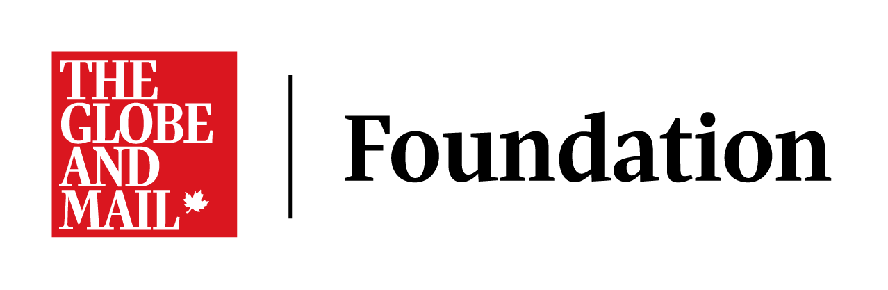
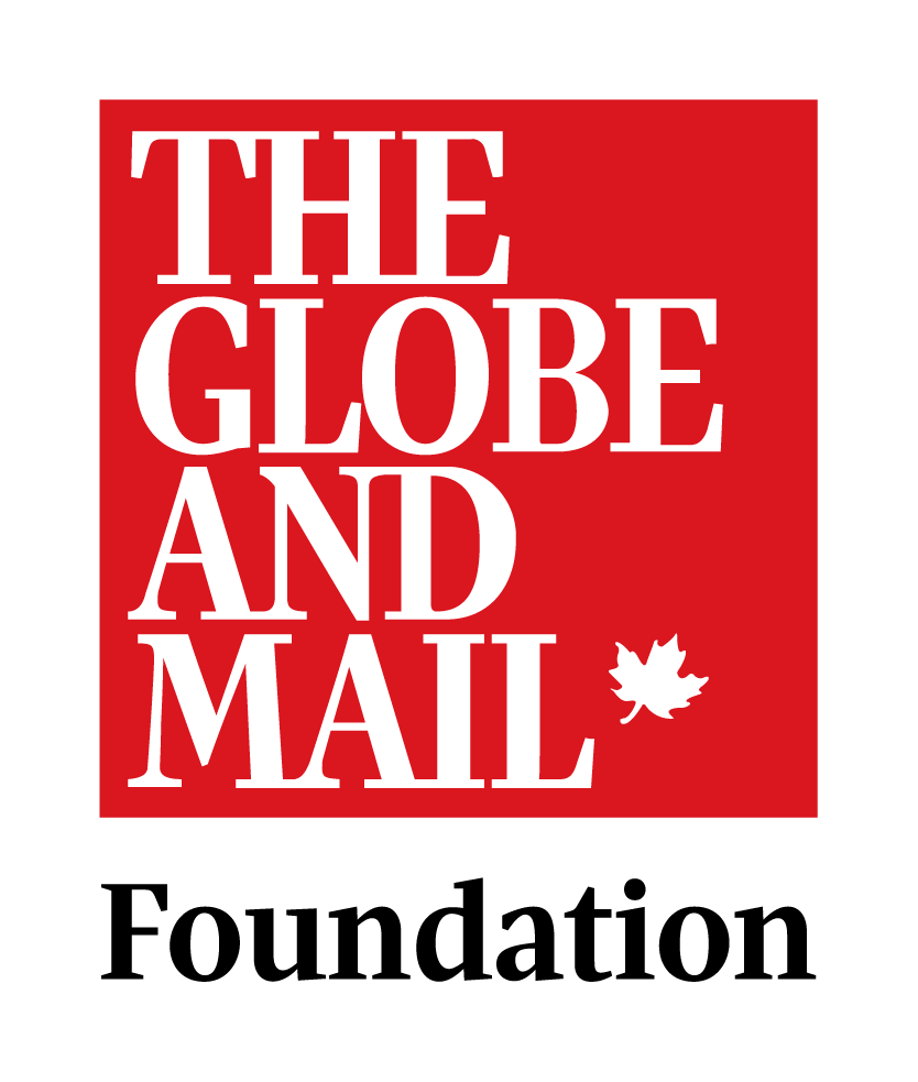
Using the Globe nameplate as a starting point, I created a clean lockup that aligned to their identity system but established the Foundation as its own entity. This included:
I assembled a concise de that covered:
This gave the team a simple, usable reference they could share internally or with partners.
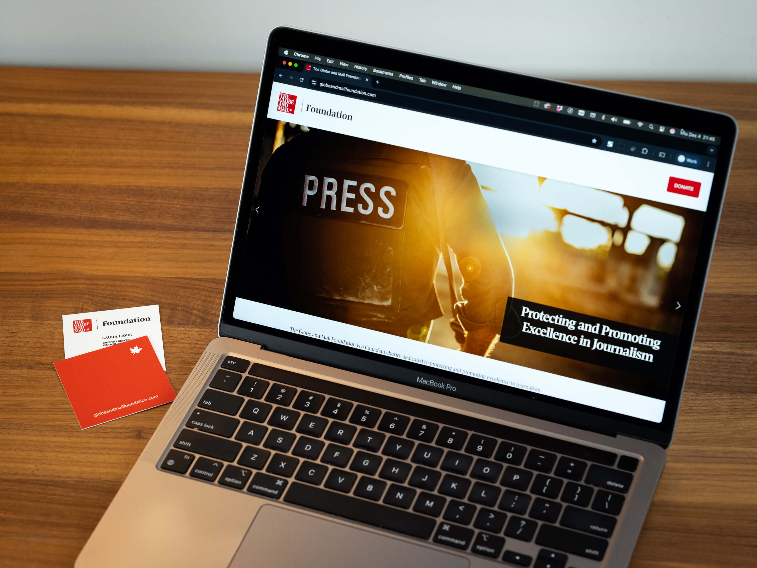
The Foundation needed to be online quickly, so I built the first version of their site using Squarespace. I created UI mockups first, then moved into a working prototype to refine layout, content flow, and hierarchy. The site was designed to be easy for their team to update while staying visually consistent.
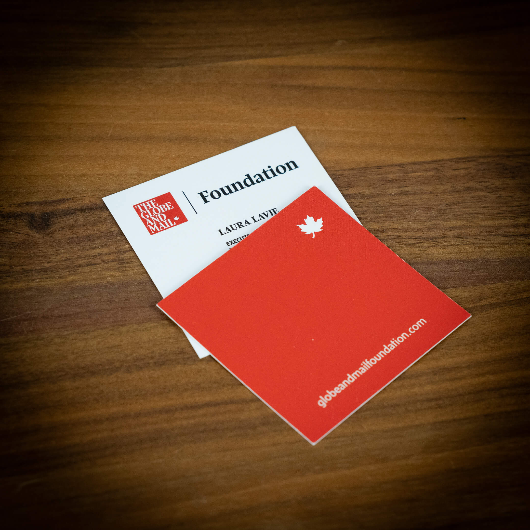
The Foundation needed physical materials for events and outreach, so I designed concepts for their business cards and stationery. The challenge was adapting a horizontal logo to a square card format while keeping the hierarchy clear and consistent with the brand system. I explored several structural layouts before landing on a version that balanced readability, proportion, and connection to Globe visual cues. These print assets are now part of their growing identity toolkit.
I set up their initial social presence, aligned profile graphics to the brand system, and helped troubleshoot platform issues. I’m now their primary contact for ongoing design needs as the Foundation expands.